FreshKit Meal Kit Web App
ANOTHER MEAL DELIVERY SERVICE? WHY FRESHKIT?
FreshKit is a meal kit delivery service that competes with companies like Blue Apron and HelloFresh.
It’s service allows users to set their food preferences and then receive automated deliveries of uncooked ingredients and recipes to their door every week. They are looking to differentiate themselves from their competition by offering a new ecommerce service that will allow users to go onto a new website and order specific meals in specific quantities for delivery on demand or within the next 7 days.

MY ROLE
Using design principles of User Research, Interaction and Interface Design, Wireframing, Prototyping, and Iteration, I created high-fidelity prototypes of the following sections of FreshKit’s new ecommerce website:
• New site homepage
• Product Search Page
• Product Detail Page
• Checkout Page
THE APPROACH
The first element was to figure out who my customer was by using a design Sprint process and making design choices based on user research.
These were some questions to help guide me through this process:
• Who is the client trying to sell to? Why? How does that person purchase this product online (i.e. do they purchase impulsively or do significant research?).
• What are the trends in the industry and how do other food-based delivery companies structure their ecommerce sites?
• What item-level information is usually shown on Product Search and Detail pages?
• What makes them choose one service or meal over another?
The preliminary research and competitive analysis was used to figure out who the typical users are for a food delivery service and whether this new product might have the same users or totally different users. Design process thinking was done in Miro.


USER SOLUTIONS
Thinking and figuring out how the User would interact with the new website using a journey map.
How do they land on this site (and from where), what is their typical purchasing behavior, and what information will they be looking for first? Are they shopping for just themselves or are they shopping for an entire family? For one day’s worth of food or ten?

Customer Journey Map
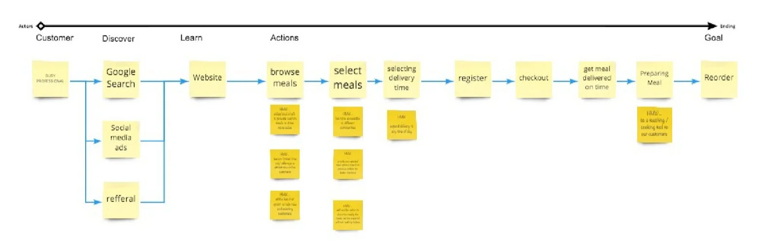
Customer Map with How Might We goals added
INITIAL SKETCHES
With the help of the user persona and use cases, I began to sketch ideas for this experience.
The end goal was to identify the best three ideas that best solved the user problem. I started creating a user flow to map out all of the different screens and to show how each of them flows into the other.

Most Viable Product - Impact vs Effort scale

INITIAL LOW FIDELITY WIREFRAME PROTOTYPE
With my idea on paper, I started to create low-fidelity mockups of the pages of the site. The wireframe prototype was created in Adobe XD that took the user through sign in to checkout.
These were some questions to help me design a better wireframe prototype.
• Homepage: How would a user intuitively like to start seeing what options are available?
• Product search page: How would you design an experience that will surprise and delight a user when they find out they can customize the page?
• Product detail page: What information would a user want to be able to see? What sort of imagery would you want to see as a user?
• Checkout page: Can you add to this page to entice the user to potentially purchase additional items, increase the quantity of their order, or something else?

HIGH FIDELITY PROTOTYPE
This has been challenging to think about how to group each meal and how a customer wants to select their meals and when they want to get it delivered.
Are there options to order ahead of time? Can you remove and add a meal plan at any time? What if you only want to order 3 meals in the meal plan if it offers 5 for the week? Do you get charged more? Or can it roll over? These are challenging problems from a user perspective on food ordering. Didn’t think it would be so difficult!

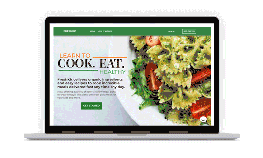
New Site Home Page

Product Search and Detail pages
I am still trying to figure out a badge system for each type of meal. Should all the Add to Cart buttons be the same color or the color of the meal?

REFLECTIONS
KEEP TRYING DIFFERENT ITERATIONS.
This project allowed me to take ownership of the website vision to drive acquisition and improve the customer experience. I learned how to develop creative from concept through to execution by researching, sketching, and wireframing. I did realize that I want to be able to see what type of meals a Food site has before signing up. I found it very frustrating that a site immediately wants you to signup with them not knowing what types of food offerings they have. Can it be an option? For example, when you are in a retail store, and the salesperson asks you, can I help you with anything, and you answer, I’m just browsing. They don’t ask you to sign up with the store first and then you can look. Very tough shopping online these days but I understand every business wants to retain their customer and have them keep coming back.
This is still a big learning process for me as tools are constantly changing and the way a user interacts drives digital platforms now more than ever.
If you are looking for Website Visual Design and Prototyping let’s discuss!