
Art direction and design for IOMs.
What is an IOM? An IOM stands for Installation Operation Manual.
Basically, your standard Instruction Manual that comes inside your product box. This is what “some people”, ahem, throw away or toss to the side, when installing or assembling a product. Only in dire circumstances, when they have extra parts leftover, when something is leaking or when something isn’t working right, do they open that IOM that comes neatly packed in the box, to read what they have missed.
Many of you have come across the infamous IKEA instruction manual that has very little instructions except for a parts breakdown. Others who have children that love LEGOS have seen wonderful 3D colorful models of step by step building in a product booklet. Regardless, if you want to use them or not, an IOM is essential to provide for every product and is very helpful to have at your fingertips.


MY ROLE
As a Packaging Designer and Branding Designer, I never knew that this area of expertise would be instrumental in my career path. In my last professional role, I started off in an Engineering department of a B2B Showering and Plumbing company, providing graphics for product labels and packaging. My initial thoughts were, how does an extremely creative individual wind up in an Engineering Department? The ways of thinking are on the opposite ends of the spectrum.
As a result of my ability to adapt to different environments and my curiosity to learn, I was able to take SolidWorks engineering courses that allowed me to work in tandem with the Product Engineers and to understand better how to properly design an Instruction Manual. I was also able to leverage these new found skills in SolidWorks to provide full 3D packaging design models that I was limited in doing in Photoshop and Illustrator.
THE CHALLENGE
* To comply with my non-disclosure agreement, I have omitted and obfuscated confidential information in this case study. I am only able to show a small preview in SolidWorks of how I worked to get views for each step.*
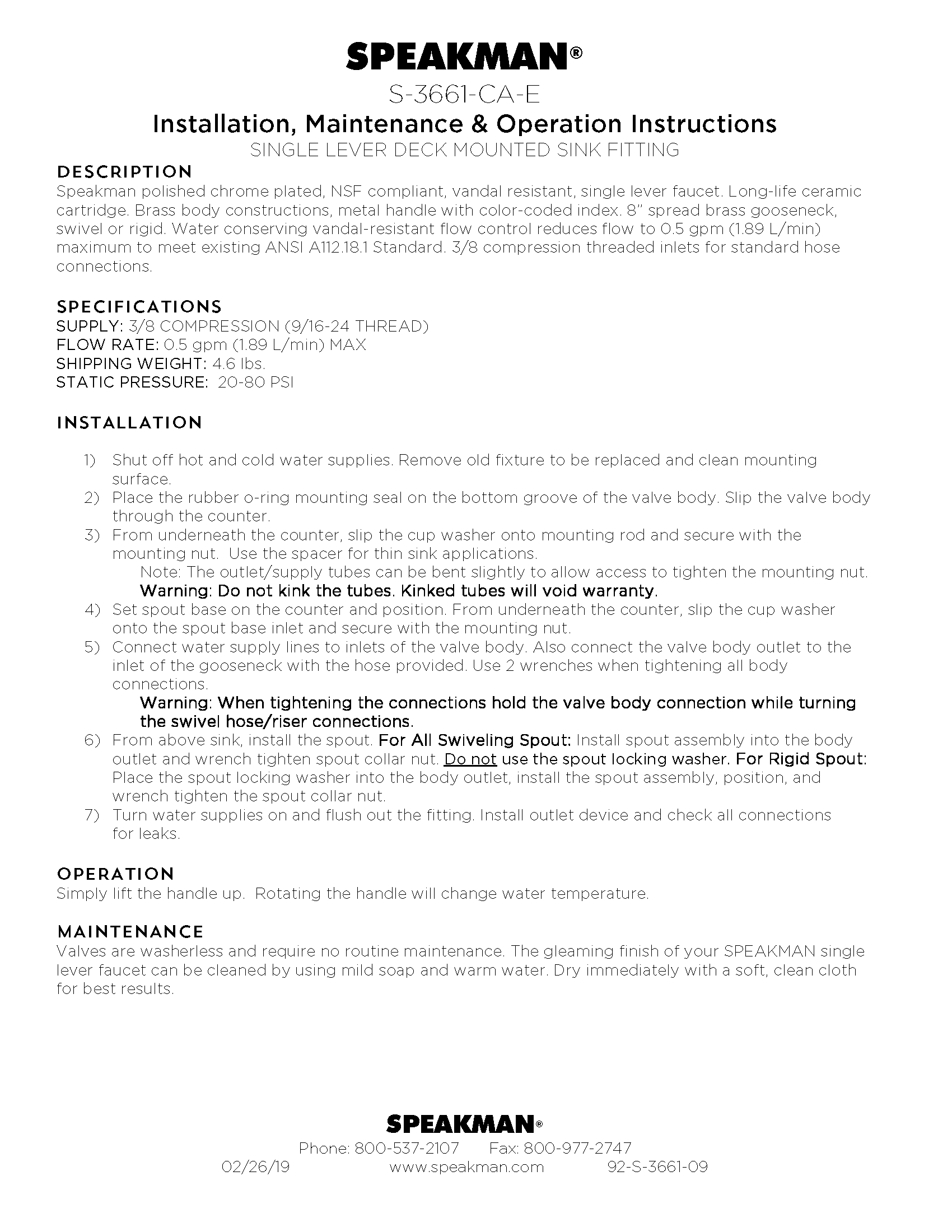
With more showering products and equipment in the pipeline, I had to become fully responsible for IOM development in all channels of business, Commercial, Residential and Safety.
My advanced skills in modeling components and assemblies, extracting engineering 3D models and constructing isometric, exploded-view illustrations from engineering drawings, provided the basis to design a fully pictorial based installation manual.
Working closely with the product Engineer I was able to take their models and place them in mock installation environments. For example: a wall mount faucet installation, I had to construct all the mounting hardware behind the wall in SolidWorks.

USER SOLUTIONS
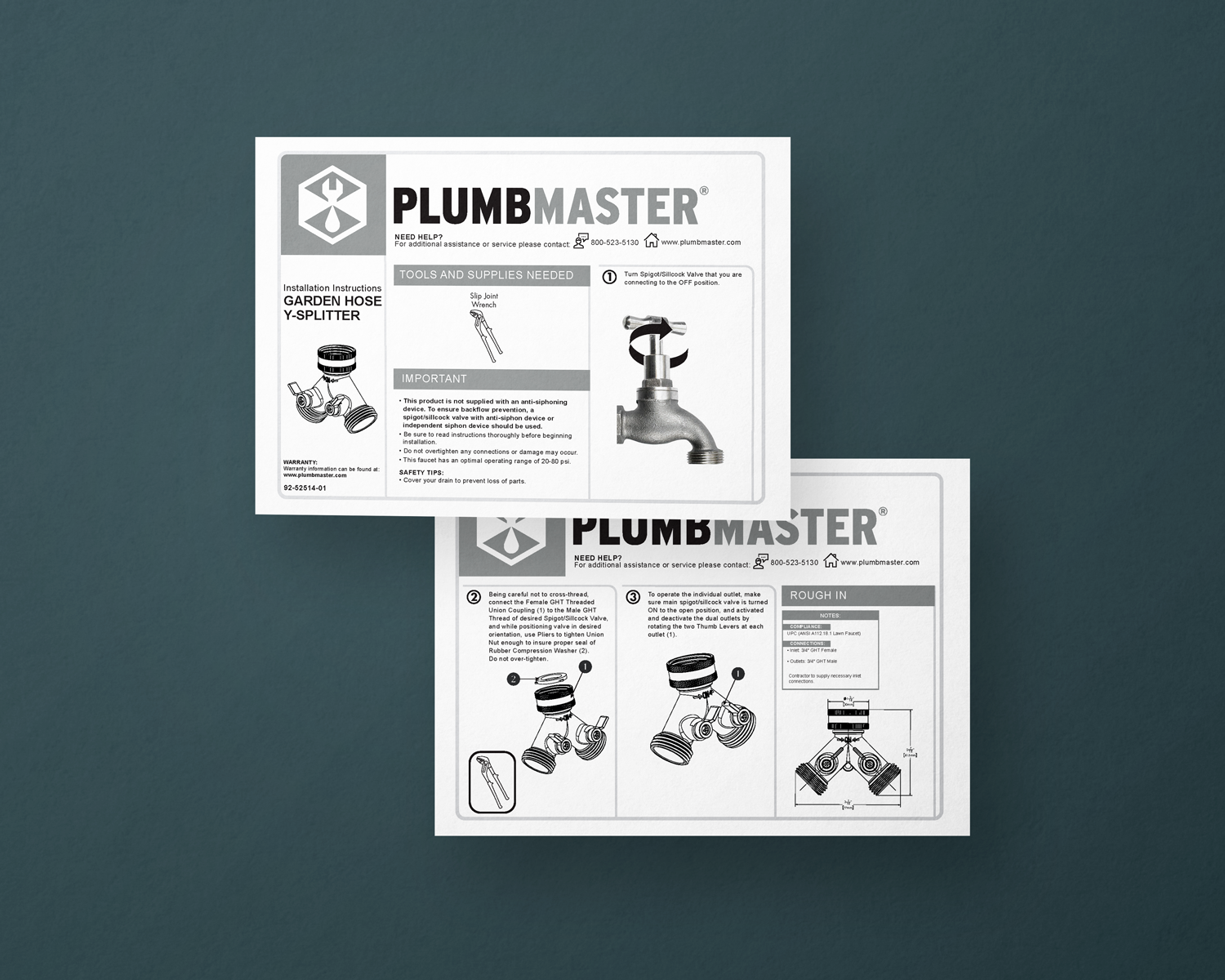
With my branding and visual design skills, I was able to upgrade previous IOM templates to a more sophisticated design system.
Original Word based IOMs


INDUSTRIAL SOLUTIONS
I was able to take my skills and apply it with an outside vendor that provides anti-ligature products for commercial use. They provided a styleguide which had changed a number of times, and I provided the design elements to work within their guidelines.

Styleguide, Logo and Image style changes

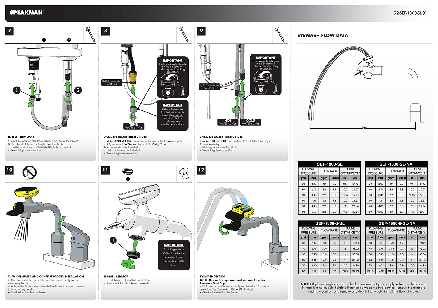
Current IOM style
VISUAL UPGRADES
When the company was acquired by a much larger plumbing supplier, I was able to completely revitalize, from concept to delivery, their existing portfolio of brands to provide an elevated customer brand awareness and experience.

Inconsistent logo, illustrations and layout with old IOMs
To come up with a new visual design system these were the main questions for me while concepting out a new IOM through many iterations.
How do I call out the brand?
What image style do I use?
To separate information from steps what style box do I use? Rounded or square?
What graphical elements can I incorporate from the old design?
What type of layout do I start with? Is it horizontal? Vertical?


The completed IOM for this brand contained these key graphical elements:
Mitered cornered blocks.
Hexagon shaped number step call outs. References the new logo design.
Grey open line shaped step boxes with mitered corners to give the new layout an airy feel and makes for easier to read text and printing when not behind closed grey container boxes.
For detailed steps the heading box container is black.
To keep some elements from the original design and make it more consistent. It would be transferable to other IOMs in the next study.
REFLECTIONS
The last IOM concept design I was working on, I was learning to use SolidWorks Composer. It allowed for quicker color model representations but never went to market.

*SolidWorks Composer preview


There are companies out there that put a lot of time and effort in making a great instruction manual piece. If you are an experienced professional or a first time DIYer, or young creative builder, take the time to flip through your manual. Makes things so much easier! Not only are these available in your product, you can access them on-the-go through your smart phone, Ipad or tablet.
I have also been able to use my experience with technical illustration models and drawings using SolidWorks to upgrade my Packaging Design Skills. Check out my Unbox case study in The Vault or request to see more.